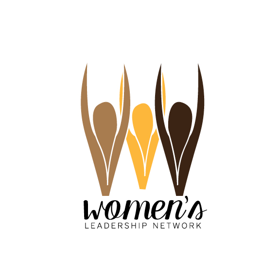
This logo was chosen for the Women's Leadership Network group, located in Farmville, Virginia. The WLN is a group of professional women that support and help each other in the community and business world. The client expressed the need for a warm, uplifting, and connected aesthetic. My logo was chosen out of the other two designs that my team members created because I captured the tone and message that the client wanted to communicate, while maintaining a feminine touch.
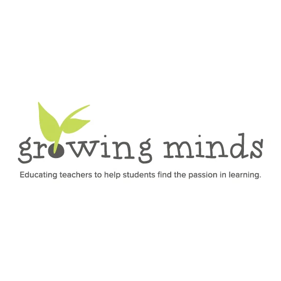
Growing Minds was my independent, year long senior project. My topic and focus was education and how schools should incorporate innovative teaching strategies in order to empower students and motivate them to want to learn. While the project included seven components in total, this logo was the start of the branding process.
The elements of this logo represent the different perspectives of the project. It symbolizes the idea of students' minds growing while teachers help nurture that growth. The seedling is a metaphor for that relationship. The design with the typographic piece depicts a kind of illustration of growth as well. The font choice is meant to give a sense of education with the handwritten feel.
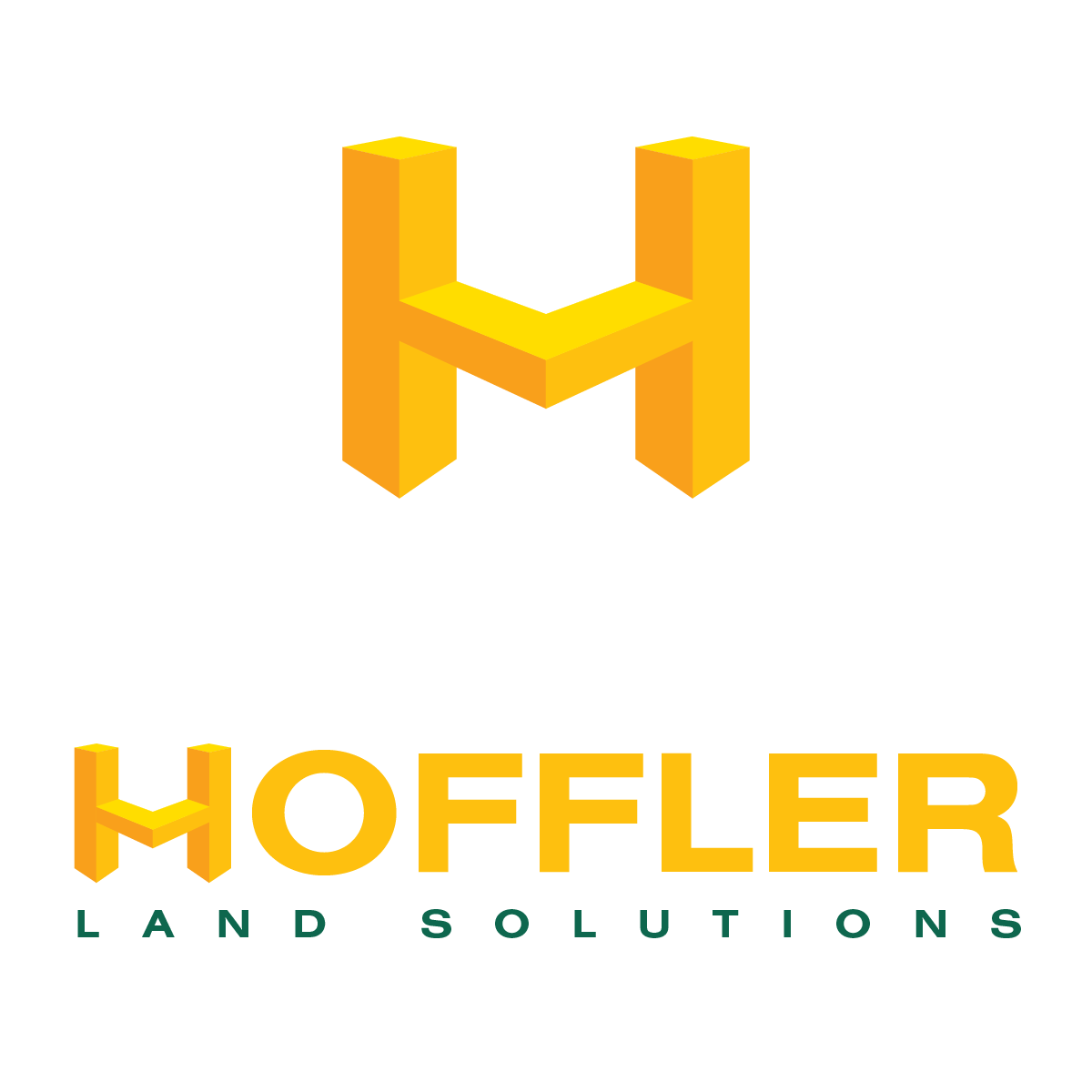
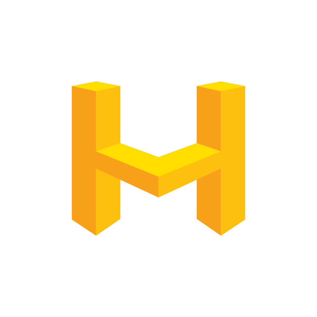
This logo was produced for a client who was branching out of the family business and starting his own. However, he wanted his brand identity to remain close to the family business identity. The color choice here reflects that. The business focuses on land clearing at the moment, but he wasn’t sure of the future potential. I rendered the “H” into a geometric, block-like design. This format conveys “building” blocks and can be interpreted and applied to any way he wanted to take his company mission.
I left the client with a detailed style guide in order for him and others to be able to use this logo correctly. Overall, the client was very happy with the final deliverables.
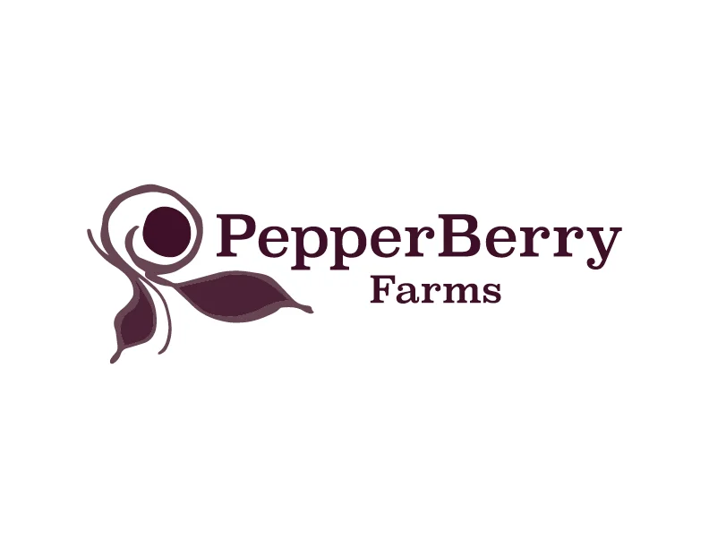
This logo was created for a berry farm that was looking to go into the wine space. The organic mark is my original design that is unique to the company in order to help them stand out on the shelf.
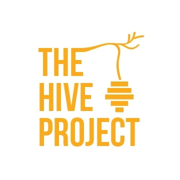
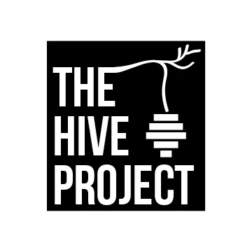
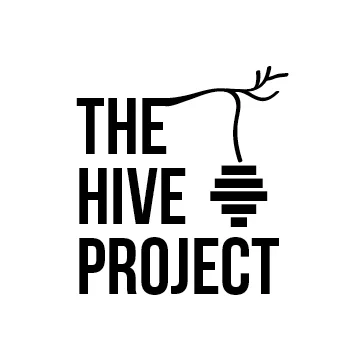
The hive project was a collaborative team project during my undergrad experience. I proposed the initial idea of the project topic, which was Colony Collapse Disorder (CCD). This issue is about the decline of the honey bee population and the importance they bring to our lives. The campaign was to create awareness of this issue to everyday people and how to help.
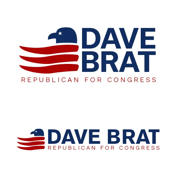
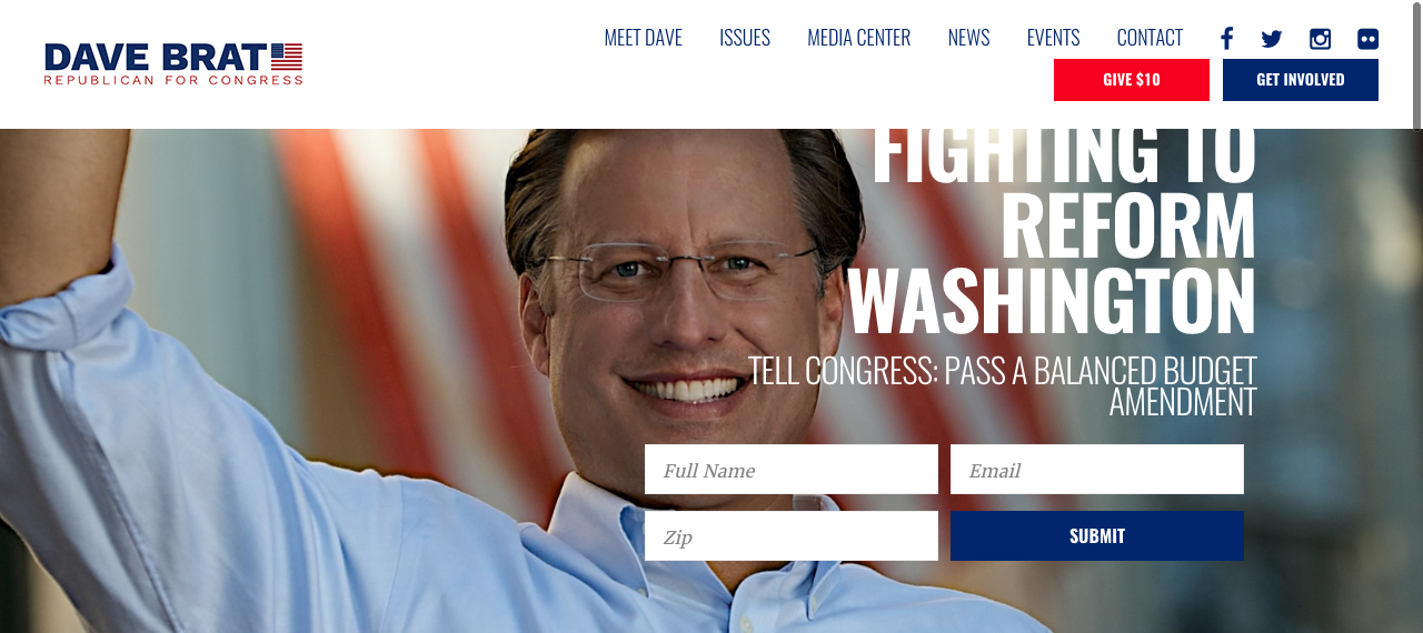
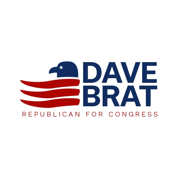
I was asked by Congressman Dave Brat to help him achieve a new look for his name. These are the top two choices that the client and I thought embodied his message the best.
For the first, Congressman Brat said that he enjoyed eagles and American flags. I designed an icon that incorporated both symbols into one. The red, white and blue keep with the american theme, of course. The red pieces act as the feathers of the eagle as well as the red stripes of the flag. The eye of the bird is a small star just to reference the stars of the flag as well.
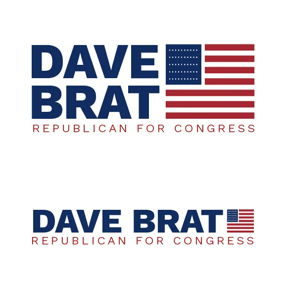
While the eagle and flag icon was my personal favorite, the client felt that a more traditional and conservative route was more appropriate. The polished and geometric flag icon was the ultimate choice for Congressman Brat.
I enjoyed the creative process of this branding job. With a strong American theme, it is easy to create something cliche. However, this job allowed me to push myself and create a design that was original and innovative.
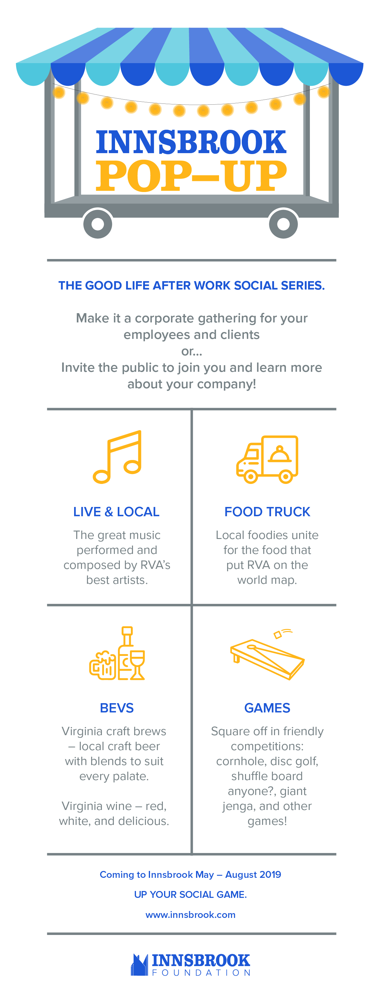
Innsbrook Pop-Ups is known as “the good life after work social series”. This project was for a new series literally “popping” up in many different locations around the office park. The series takes place from May – August and features a casual social scene where Innsbrook employees can stop in on their way out of the park for some local live music, a light bite from food trucks, cold beverages, and some friendly competition featuring a variety of games.
The logo itself reflects the Innsbrook brand by incorporating the signature blue on the awning. The awning symbolizes aspects suck as tents, vendors, and food trucks. The concept of the portable stage with warm lighting suggests the inviting evening environment where live music will be featured. Branding this new event series for Innsbrook was a fun and fresh experience.
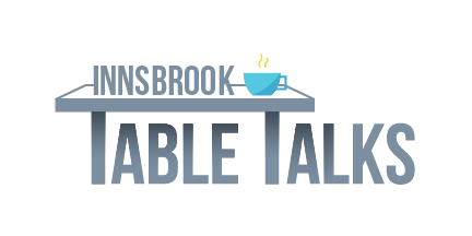
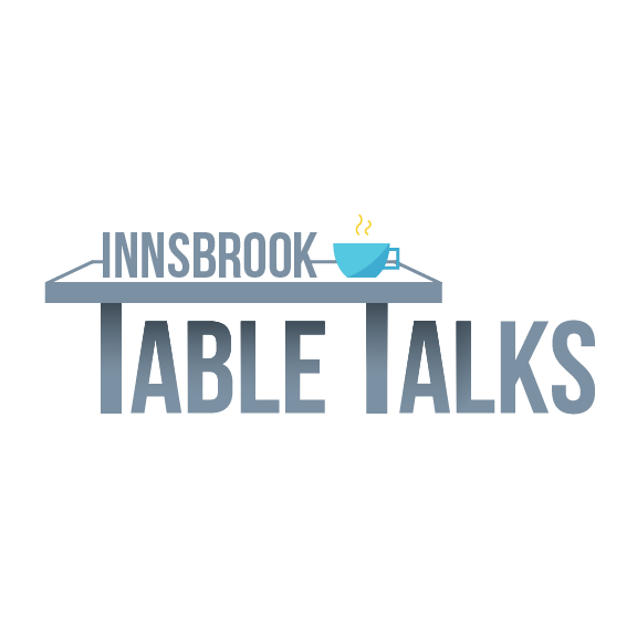
Innsbrook Table Talks was a meticulous rebranding project. Innsbrook Table Talks is a place where members of the community, near and far, can come together for networking, a hot meal, and really insightful speakers once monthly. Innsbrook itself is the largest business park in Virginia, with over 400 businesses present within the area.
The new branding of the monthly event, which was first known as Innsbrook Executives' Breakfast, was aimed at a more welcoming, open forum of discussion. Before, it was thought the title was too harsh and seemed to only appeal to actual "executives" and not the average employee looking to be successful.
The new logo accomplishes an inviting feeling for all, beginners and CEOs alike. The blue of the logo incorporates and refers to the iconic blue of the Innsbrook brand. The mug on the "table" hints at friendly, warm conversation.
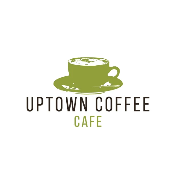
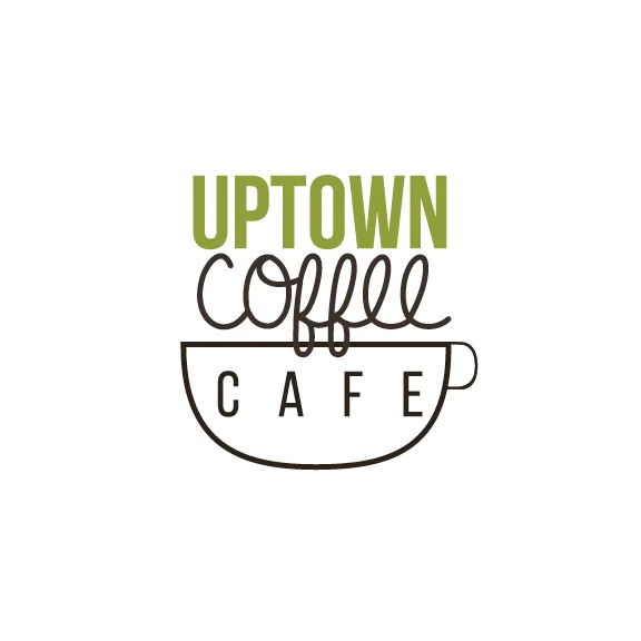
Uptown Coffee was created out of my own curiosity. This is a quaint spot in downtown Historic Farmville, Virginia. This place is a student-favorite to study, spend time with friends, and have a delicious cup of joe.
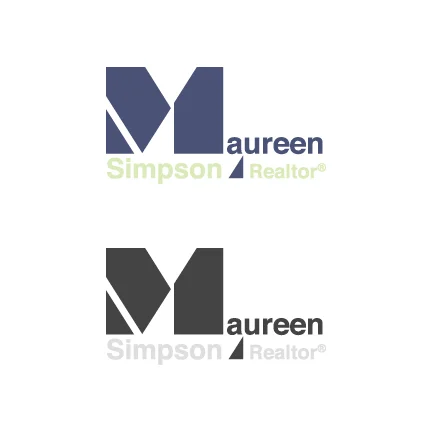
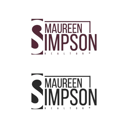
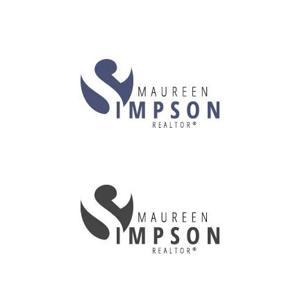
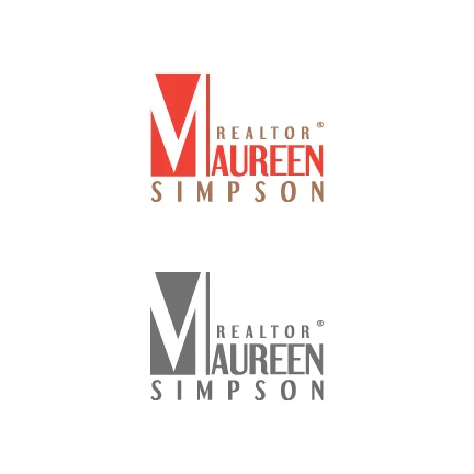
Here is a showcase of various logo designs for realtor Maureen Simpson. I produced these during my internship with Sattler Creative in Richmond, Virginia. The realtor was a client of Sattler Creative and I aided with the work load of this logo and branding design by exploring different approaches.